In Vino Veritas
Typography Illustration design available for print, apparel and produts. Check it out on my Redbubble shop.
-
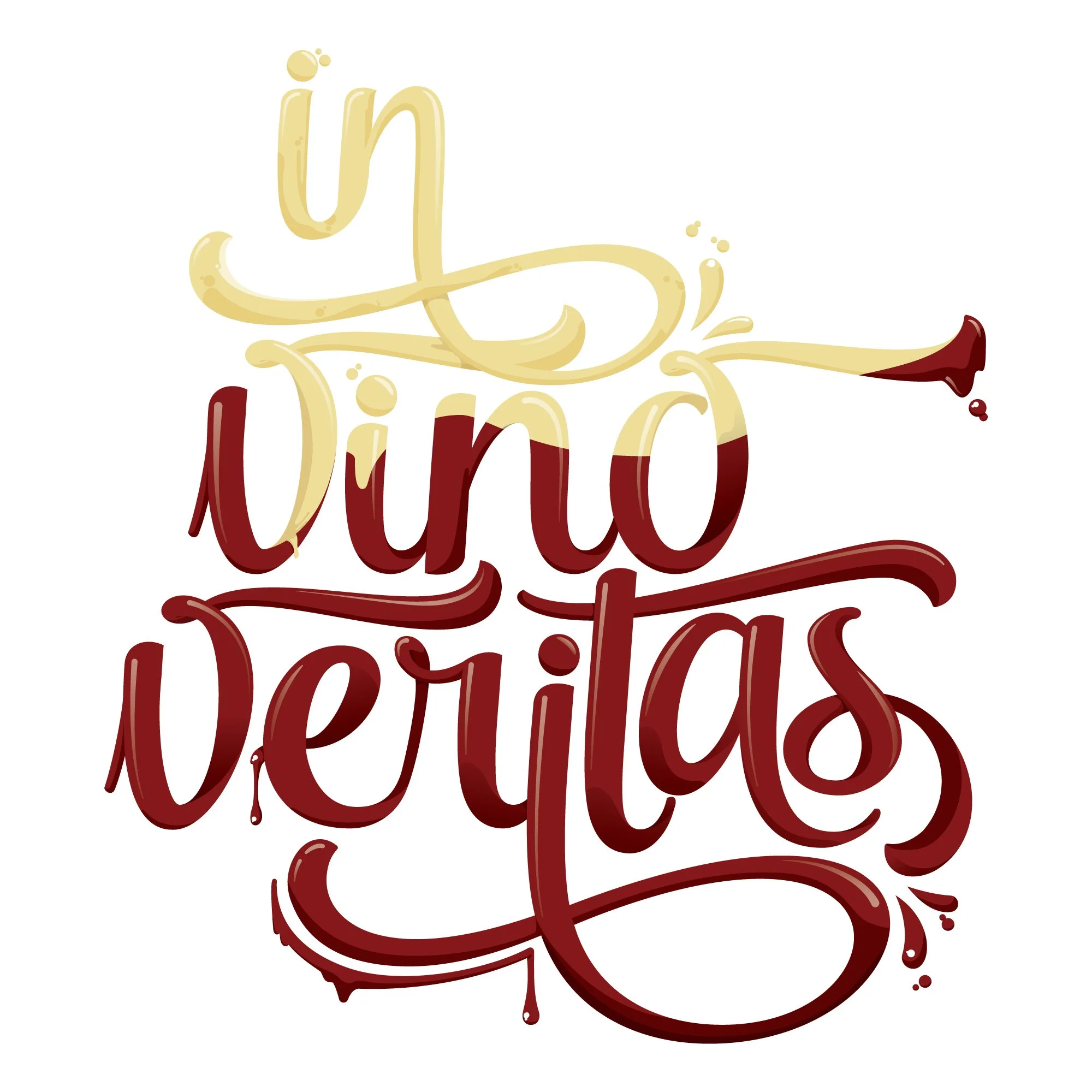
This self made project came from a saying that inspired me and I wanted to make something to match it. The red and white wine flowing through the letterform is obvious but I wanted to take advantage of the fonts’ swashes and then tweak them to create an overlapped 3D effect. Then I added complimentary embellishments and details.
-
Masking is really the key here. Make sure you work with your outlined letterform as a united object. Don’t forget to expand and then bring in your art inside it. Lastly make sure your shadow elements are also aligned perfectly and I recommend clipping them short enough to not get in the way of other elements you might do.
-
Shading: You might be working in RGB and That’s fine if you’re keeping your art for web portfolios. But printing files for paper need to be in CMYK. You’ll love some brightness but uploading RGB files for online stores like Redbubble and Society6 require RGB so the rub is when it prints it might lose some brightness after the fact. Watch your color and how it looks upon conversion.
-
Concept is king. Sketch out your stuff until you have the idea down before hopping onto Illustrator. It’s better to check your flow before you get started and you can even trace your work to make sure you’re getting the flow to look right but don’t forget to have fun.